Working session
System audit
What's in production, split App | Web 2.0, plus the design.md canon — 303 rows. Call each item keep, change, delete, or investigate; every marker's call is recorded separately, so splits stay visible, and each row carries a comment thread. Marks save on your device and sync live to the group when the store is connected.
App
rumor-mobile-expo, as shipped — every src/components/ui primitive on main, plus the token vocabulary.
App components 0/79
Everything in src/components/ui on main (snapshot 08-31) — compound folders count once.
accordionspecimen · 199 lines
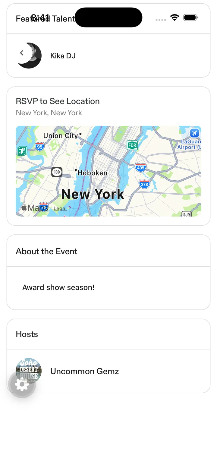
About the Event / Hosts cards · tap to open full size exportsAccordion · AccordionContent · AccordionItem · AccordionTriggeraction-bannerpeek · 144 lines
variantwarningdangerinfoexportsActionBanneranchored-popoverpeek · 225 lines
propschildren · closeLabel · onClose · open · triggerLayout · portalName · align · fixedWidth · offset · maxHeight · panelClassName · contentWrapperClassName · contentClassName · scrollable · zIndex · dismissGuardexportsDROPDOWN_Z_INDEX · useAnchoredPopover · useAnchoredDropdown · AnchoredPopover · InviteAnchoredDropdown · DROPDOWN_PANEL_SHADOWanchored-selectpeek · 185 lines
propsvalue · options · onSelect · placeholder · disabled · align · fixedWidth · triggerClassName · accessibilityLabel · testID · closeLabel · displayLabel · zIndex · showCaretexportsAnchoredSelectanchored-tooltippeek · 221 lines
propscontent · children · side · maxWidth · tip · arrowColor · bubbleClassName · zIndex · accessibilityLabel · closeAccessibilityLabel · triggerTestID · triggerClassName · triggerHitSlopexportsAnchoredTooltipandroid-keyboard-spacerpeek · 39 lines
propsbottomInsetexportsAndroidKeyboardSpaceranimated-segmented-controlspecimen · 700 lines
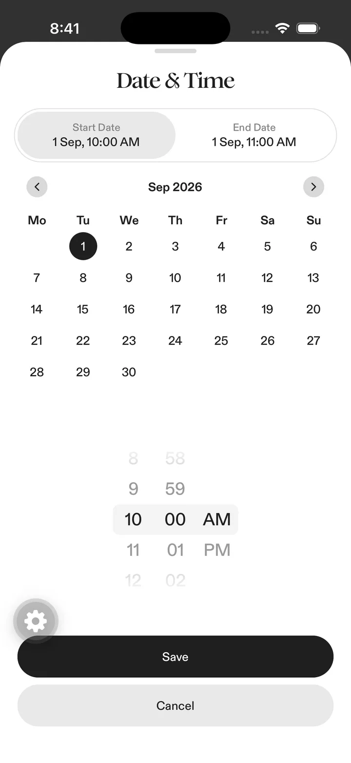
start/end toggle (animated variant lives on home header) · tap to open full size propsoptions · value · onChange · className · testID · optionTestIDPrefix · segmentClassName · activeSegmentClassName · textClassName · activeTextClassName · badgeTone · disabled · progress · progressDriven · overscroll · variantexportsPILL_DURATION_MS · AnimatedSegmentedControlapp-headerspecimen · 52 lines
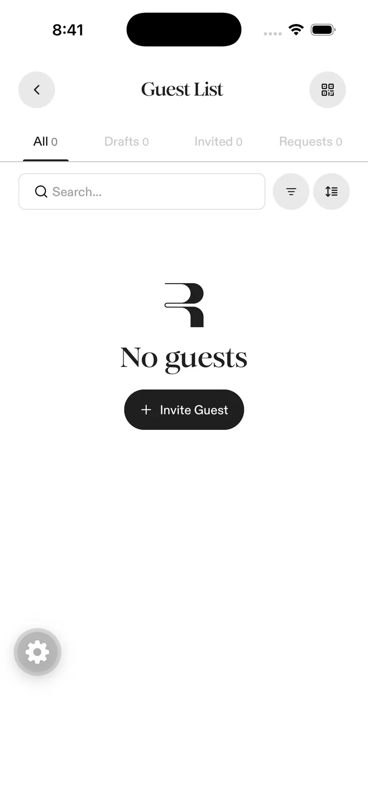
Guest List header — back button, Romie title, QR action · tap to open full size propstitle · hideBackButton · children · className · titleClassName · titleStyle · backButtonClassName · backIconSize · styleavatarspecimen · 226 lines
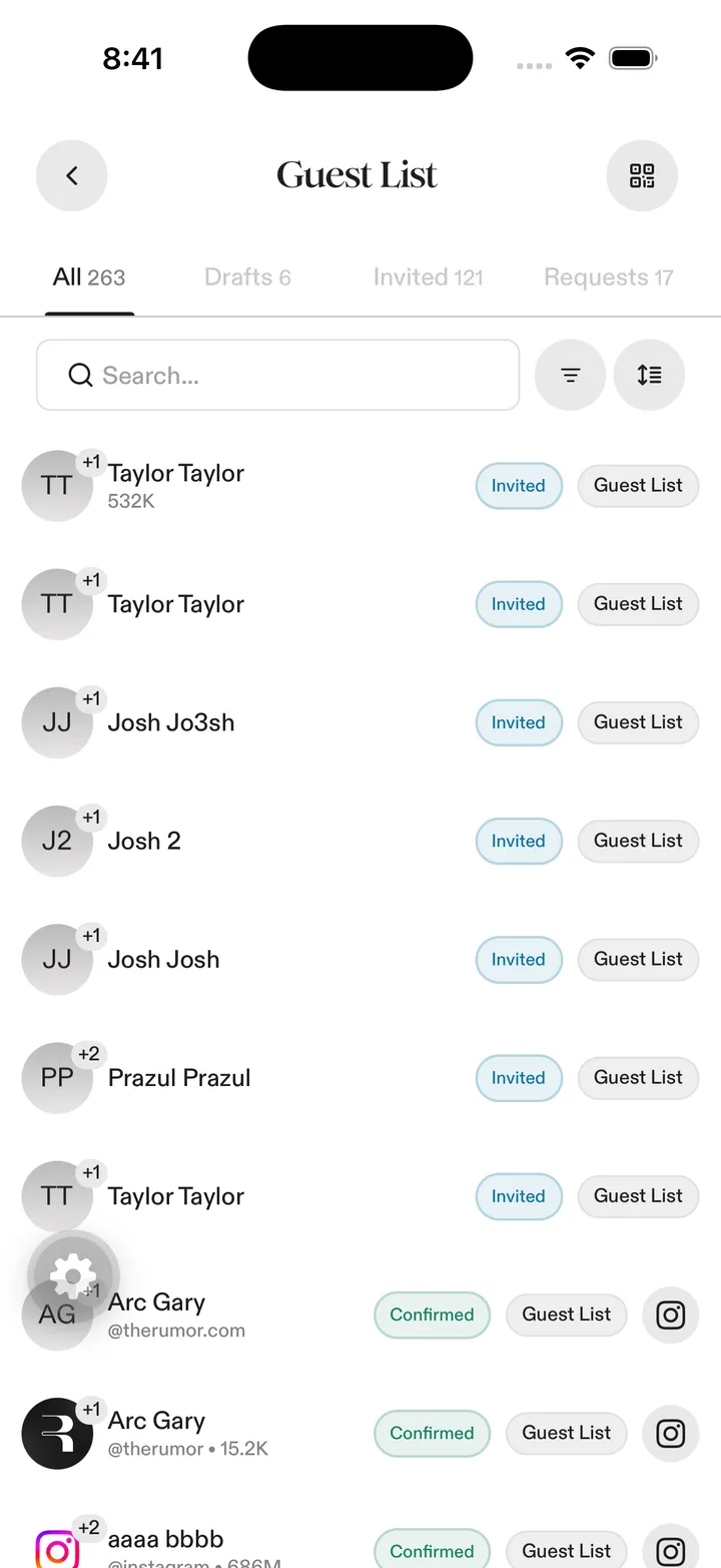
guest avatars with +1/+2 count badges · tap to open full size exportsAvatar · AvatarImage · AvatarFallback · AvatarWithFallbackbadgespecimen · 35 lines
status pills: Invited / Confirmed; also the VIP pill on tickets · tap to open full size variantdefaultsecondaryoutlinedestructiveexportsBadge · badgeVariantsbannerpeek · 43 lines
variantneutralinformationbottom-action-barspecimen · 54 lines
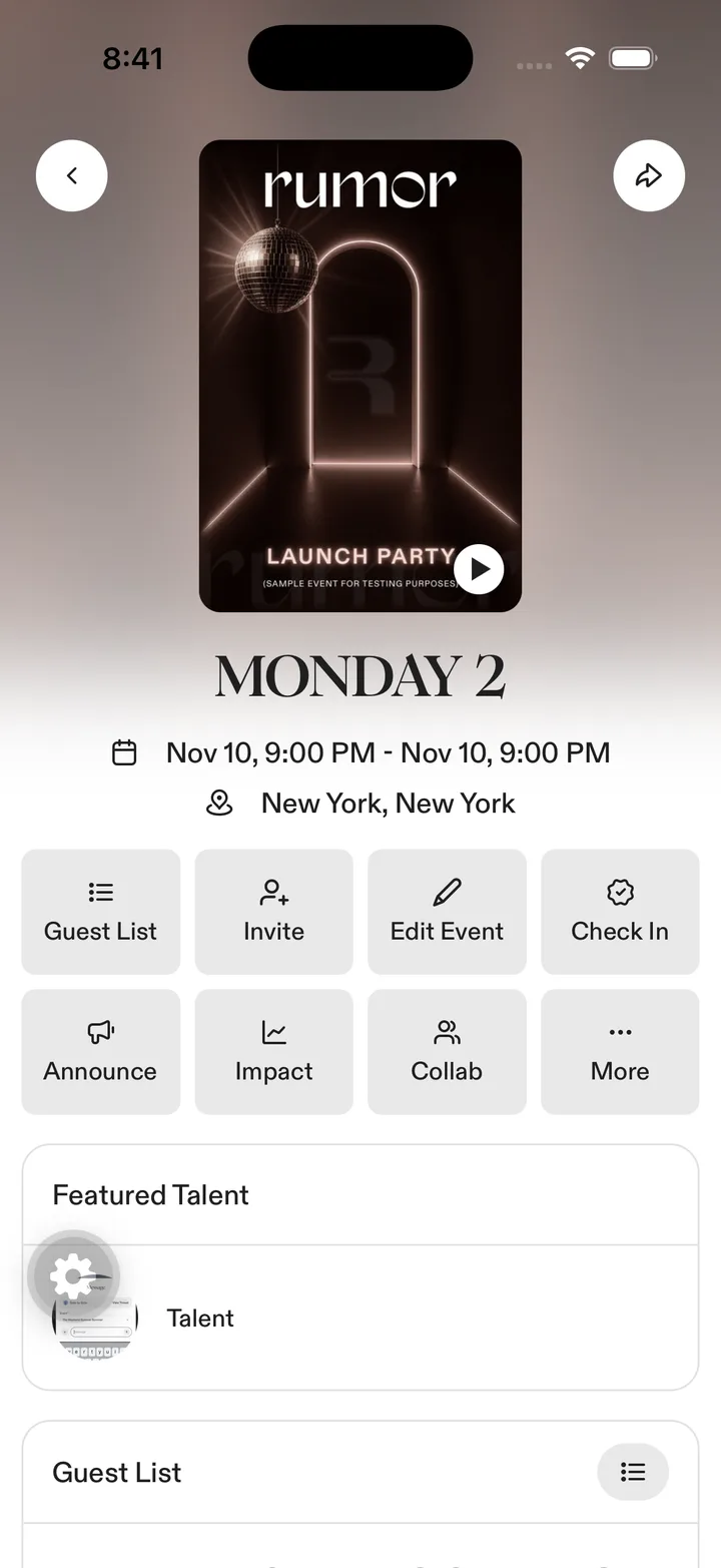
Save Draft / Create Event bar · tap to open full size propsclassName · childrenexportsBOTTOM_ACTION_BAR_CLASSNAME · BOTTOM_SHEET_ACTION_FOOTER_CLASSNAME · BOTTOM_SHEET_ACTION_FOOTER_FLAT_CLASSNAME · BOTTOM_ACTION_BAR_SHADOW_STYLE · BottomActionBarbottom-fadepeek · 39 lines
propsheight · classNameexportsBottomFadebottom-scrimpeek · 28 lines
exportsBottomScrimbottom-sheetspecimen · 753 lines
Date & Time sheet over Create Event · tap to open full size propsopen · onClose · children · snapPoints · index · animateIndexChange · enablePanDownToClose · enableHandlePanningGesture · closeOnBackdropPress · topInset · bottomInset · onChange · backdrop · footer · footerStyles · footerClassName · blurIntensity · blurTint · backdropBlur · className · containerStyle · backgroundLayer · contentClassName · handleClassName · handleIndicatorClassName · handleContent · backdropClassName · disableKeyboardOffset · extendHeightOnKeyboard · keyboardOffsetFactor · topCornerRadius · springConfig · focusOnOpen · resyncSnapOnHeightChangeexportsBottomSheetHeader · BottomSheet · BottomSheetView · BottomSheetKeyboardAvoidingbottom-sheet-actionspeek · 309 lines
propsactions · className · titleexportsBottomSheetRemovePrompt · BottomSheetActionList · BottomSheetPillActions · BottomSheetMessage · BottomSheetConfirmationbottom-sheet-newpeek · 1594 lines
propschildren · classNameexportsBottomSheet · BottomSheetButtons · BottomSheetHeader · BottomSheetKeyboardAvoiding · BottomSheetTitlebuttonspecimen · 193 lines
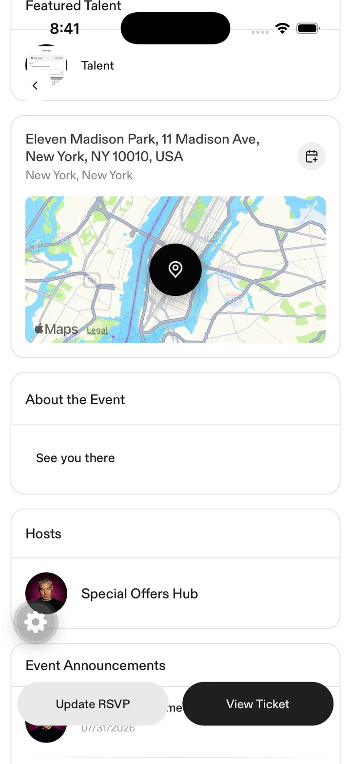
Ticket / Update / Chat / Share action buttons · tap to open full size variantdefaultsecondaryselectoroutlineghostdestructivedestructiveSoftreversedsizedefaultxssmlgxliconicon-mdicon-smicon-lgexportsuseButtonDisabled · Button · ButtonTextcheckboxpeek · 59 lines
propsindeterminateexportsCheckboxchrome-risepeek · 70 lines
propschildren · className · delay · duration · distance · easingexportsCHROME_RISE_EASING · ChromeRisecollapsiblespecimen · 40 lines
expanding info cards · tap to open full size exportsCollapsiblecompact-switchpeek · 35 lines
propschecked · onCheckedChangeexportsCompactSwitchcontrolled-inputspecimen · 34 lines
form inputs on Create Event · tap to open full size propscontrol · nameexportsControlledInputcustom-auto-scrollpeek · 57 lines
exportsCustomAutoScrolldate-time-sheetspecimen · 382 lines
calendar + time wheel + start/end segmented · tap to open full size propsopen · onClose · title · saveLabel · isSaving · timeZone · showGuestNoticeexportsDateTimeSheetdialogpeek · 371 lines
exportsCENTERED_DIALOG_WINDOW_TEARDOWN_MS · Dialog · DialogCenteredContent · DialogClose · DialogContent · DialogDescription · DialogFooter · DialogHeader · DialogOverlay · DialogPortal · DialogSheetContent · DialogSheetHandle · DialogTitle · DialogTriggerdropdown-menupeek · 82 lines
propstrigger · items · contentClassNameexportsDropdownMenufaded-dividerpeek · 34 lines
propsclassNameexportsFadedDividerfading-dividerspecimen · 69 lines
card section dividers · tap to open full size propscolor · className · orientation · lengthexportsFadingDividerfilter-sheet-footerpeek · 78 lines
propsapplyDisabled · clearDisabled · onApply · onClear · applyTestID · clearTestIDexportsFilterSheetFooterfloating-add-buttonspecimen · 51 lines
+ Invite Guest CTA · tap to open full size propsonPress · accessibilityLabel · testID · className · style · elevatedexportsFloatingAddButtonform-error-textpeek · 33 lines
propsmessage · testID · classNameexportsFormErrorTextform-fieldspecimen · 40 lines
Date & Time / Location / Description rows · tap to open full size propslabel · required · error · children · classNameexportsFormFieldglass-buttonspecimen · 38 lines
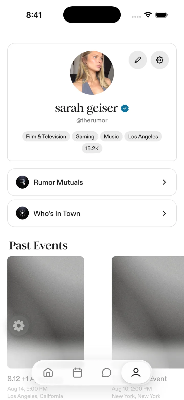
View details CTA over the glow · tap to open full size exportsGlassButtonhaptic-pressablepeek · 30 lines
exportsHapticPressablehorizontal-scroll-fadespecimen · 122 lines
Mutuals Attending row · tap to open full size exportsHorizontalScrollFadeinfo-tooltippeek · 58 lines
propslabel · side · iconSize · iconColor · maxWidth · tip · bubbleClassName · zIndex · accessibilityLabel · testIDexportsInfoTooltipinputpeek · 213 lines
propsclassName · variant · hasError · hideKeyboardAccessoryexportsInput · SearchInputkeyboard-accessory-hostpeek · 20 lines
exportsKeyboardAccessoryHostkeyboard-done-accessorypeek · 37 lines
exportsKeyboardDoneAccessorykeyboard-done-barpeek · 58 lines
exportsKeyboardDoneBarkeyboard-radius-accessorypeek · 23 lines
exportsKeyboardRadiusAccessorykeyboard-spacerpeek · 30 lines
exportsKeyboardSpacerleave-without-saving-sheetpeek · 50 lines
propsopen · onClose · onConfirm · title · description · confirmLabelexportsLeaveWithoutSavingSheetlink-sheetpeek · 96 lines
propsopen · onClose · onAddexportsLinkSheetmap-previewspecimen · 61 lines
location map card · tap to open full size propslatitude · longitude · classNameexportsMapPreviewnotification-badgespecimen · 58 lines
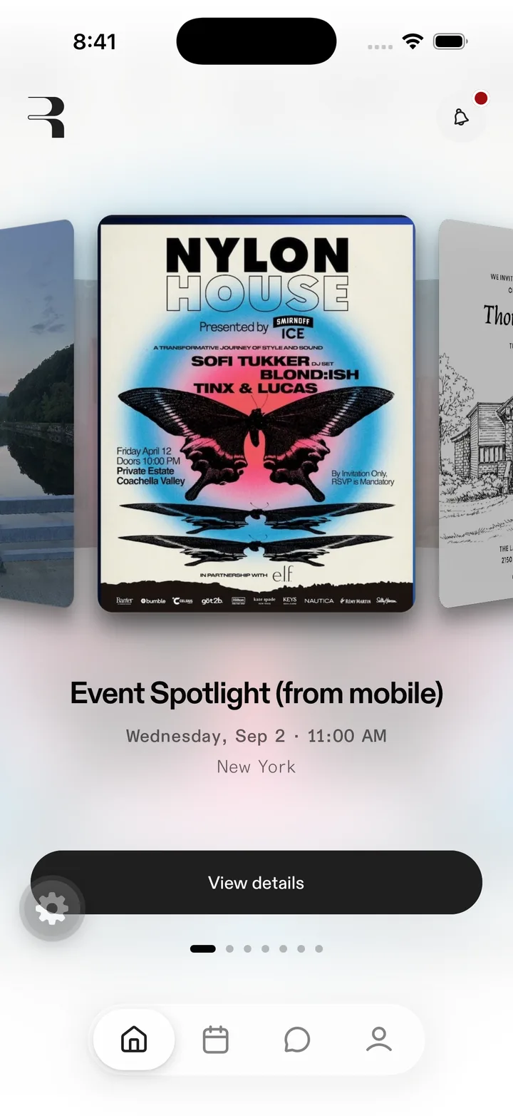
red dot on the bell, top right · tap to open full size propscount · tone · classNameexportsNotificationBadgeotp-inputpeek · 156 lines
propsvalue · testID · length · editable · hasError · className · cellClassName · cellTextClassName · autoFocus · placeholder · onFilled · onChangeTextexportsOtpInputpdf-viewpeek · 66 lines
propsuri · label · style · page · singlePage · forcedWidthFitexportsPdfViewphone-inputpeek · 607 lines
propscountry · onCountryChange · value · onChangeText · onBlur · hasError · autoFocus · editable · placeholder · size · hideKeyboardAccessory · autofillOwnNumber · textClassName · testIDexportsPhoneInputpill-trackspecimen · 463 lines
page dots under the spotlight card · tap to open full size propsclassName · styleexportsPillTrackIndicator · PillTrackItem · PillTrackposter-headerspecimen · 47 lines
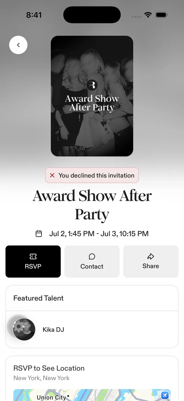
event details poster header · tap to open full size exportsPosterHeaderradiopeek · 41 lines
propsselected · size · testIDexportsRadioread-more-togglepeek · 28 lines
exportsReadMoreTogglereorderable-listpeek · 279 lines
propsitems · keyFor · rowHeight · onReorder · renderRow · rowClassName · className · separatorClassName · showSeparators · dragEnabledexportsReorderableListrich-text-editorpeek · 140 lines
propseditorRef · initialContent · placeholder · onChange · onFocus · onBlur · placeholderColor · contentFontWeight · fill · readOnly · scrollEnabled · onHeightChange · styleexportsRichTextEditorrich-text-toolbarpeek · 91 lines
propseditor · onInsertLink · classNameexportsRichTextToolbarscroll-edge-fadepeek · 62 lines
propsedge · heightexportsTOP_FADE_HEIGHT · BOTTOM_FADE_HEIGHT · ScrollEdgeFadescroll-revealpeek · 138 lines
exportsScrollRevealProvider · useScrollRevealsegmented-controlspecimen · 166 lines
Start Date / End Date segmented toggle · tap to open full size propsoptions · value · onChange · className · testID · optionTestIDPrefix · segmentClassName · activeSegmentClassName · textClassName · activeTextClassName · badgeTone · disabled · hitSlop · fitContent · selectionTransition · durationMs · crossFadeDurationMsexportsSegmentedControlselectpeek · 128 lines
exportsSelect · SelectContent · SelectGroup · SelectItem · SelectItemIndicator · SelectItemText · SelectLabel · SelectOverlay · SelectPortal · SelectSeparator · SelectTrigger · SelectValueseparatorspecimen · 27 lines
row dividers · tap to open full size exportsSeparatorsheet-titlespecimen · 19 lines
“Date & Time” sheet title · tap to open full size exportsBottomSheetTitleskeletonpeek · 64 lines
propsenabled · children · classNameexportsSkeleton · SkeletonPlaceholdersort-option-pillspeek · 79 lines
propsoptions · classNameexportsCOMPACT_SORT_SHEET_CONTENT_CLASS_NAME · COMPACT_SORT_SHEET_HANDLE_CLASS_NAME · COMPACT_SORT_SHEET_HANDLE_INDICATOR_CLASS_NAME · SortOptionPillssquircle-viewspecimen · 117 lines
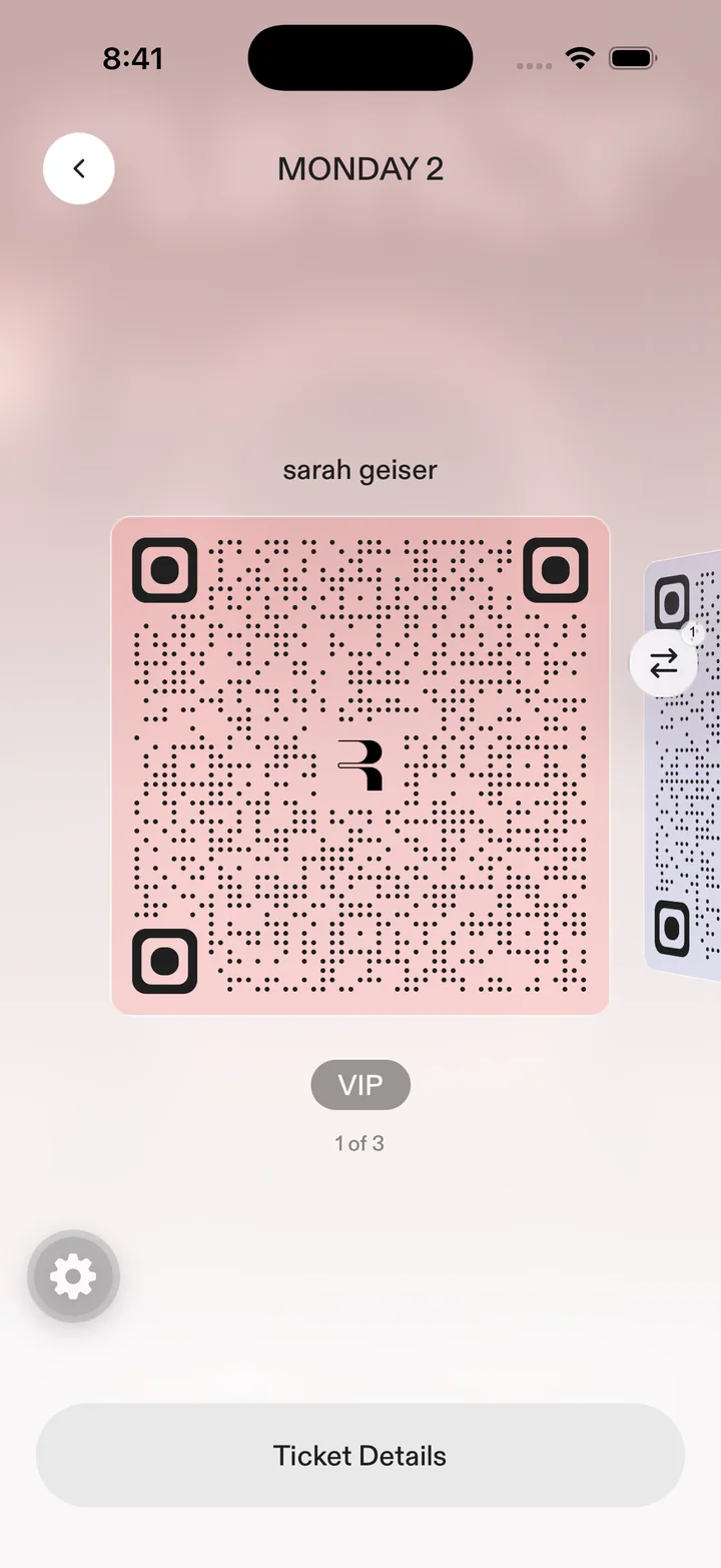
ticket card corners (continuous curvature) · tap to open full size propschildren · radius · smoothing · strokeColor · strokeWidth · styleexportsSquircleViewstep-counterspecimen · 114 lines
“1 of 3” under the ticket · tap to open full size propscount · activeIndex · classNameexportsStepCounterstory-progress-barpeek · 42 lines
exportsStoryProgressBarswipeable-rowspecimen · 369 lines
guest rows (swipe for actions) · tap to open full size propsonDelete · actions · children · className · action · actionLabel · exitOnAction · onExitStart · footer · exitProgressexportsSWIPEABLE_ROW_EXIT_STEP_DURATION_MS · SwipeableRowswitchpeek · 80 lines
propssizeexportsSwitchtab-selectorspecimen · 841 lines
All / Drafts / Invited / Requests header tabs · tap to open full size exportsSegmentedTabList · SegmentedTabSelector · StaticContentBlock · SwipePressGuardtabular-figurepeek · 58 lines
exportsTABULAR_NUMERALS · TabularFiguretextspecimen · 30 lines
Romie title + Diatype/Semi-Mono support text · tap to open full size exportsText · TextClassContexttext-inputspecimen · 56 lines
Event Name + form rows · tap to open full size propshideKeyboardAccessoryexportsTextInputtextareapeek · 59 lines
propsclassNameexportsTextareatoastspecimen · 110 lines
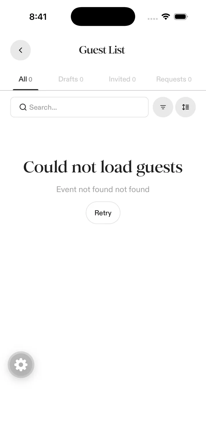
permission-denied toast over Guest List · tap to open full size exportsToasttoast-badgespecimen · 121 lines
toast presentation · tap to open full size propsmessage · options · onClear · children · className · contentClassNameexportsToastBadgetooltippeek · 77 lines
propsside · colorexportsTOOLTIP_TIP_WIDTH · TOOLTIP_TIP_HEIGHT · Tooltip · TooltipArrow · TooltipContent · TooltipOverlay · TooltipPortal · TooltipTriggertypographyspecimen · 52 lines
the event-details type stack · tap to open full size variantcaption-meddescriptionlabel-medbody-medsmall-medtitle-5alignleftcenterrightpropschildren · color · className
App tokens 0/77
The closed vocabulary from token-map.json (generated 07-01 from tailwind.config.js; near-duplicate noise already excluded).
color/background#ffffff · bg-background
color/foreground#1f1f1f · text-foreground
color/card#ffffff · bg-card / text-card-foreground
color/popover#ffffff · bg-popover / text-popover-foreground
color/primary#1f1f1f · bg-primary / text-primary
color/primary-fg#ffffff · text-primary-foreground
color/secondary#eeeeee · bg-secondary / text-secondary
color/muted#f7f7f7 · bg-muted
color/muted-fg#a2a1a1 · text-muted-foreground
color/accent#f3eeea · bg-accent
color/accent-fg#a28b7f · text-accent-foreground
color/destructive#9d0d11 · bg-destructive / text-destructive
color/border#e1e1e1 · border-border
color/input#e1e1e1 · border-input
color/ring#1f1f1f · ring-ring
color/rumor-lime#b7ff00 · bg-rumor-lime / text-rumor-lime
color/rumor-black#1f1f1f · bg-rumor-black / text-rumor-black
color/near-black#050505 · bg-near-black
color/warm-stone#cdbab1 · bg-warm-stone / text-warm-stone
color/support-global-link#a28b7f · text-support-global-link
color/success#167e60 · text-success / bg-success
color/success-bg#e8f2ef · bg-success-bg
color/success-border#b9d8cf · border-success-border
color/warning#d9a21f · text-warning / bg-warning
color/warning-bg#fef8e9 · bg-warning-bg
color/warning-border#fbe8bd · border-warning-border
color/danger#9d0d11 · text-danger / bg-danger
color/danger-bg#f5e7e7 · bg-danger-bg
color/danger-border#e2b6b8 · border-danger-border
color/info#0d729d · text-info / bg-info
color/info-bg#e7f1f5 · bg-info-bg
color/info-border#b6d5e2 · border-info-border
color/content-neutral#b5b5b5 · text-content-neutral
color/content-neutral-body#838282 · text-content-neutral-body
color/content-neutral-soft#9b9b9b · text-content-neutral-soft
color/content-neutral-disabled#9c9c9c · text-content-neutral-disabled
color/content-neutral-placeholder#a2a1a1 · text-content-neutral-placeholder
color/surface-muted#efefef · bg-surface-muted
color/surface-warm#e8e0db · bg-surface-warm
color/divider-soft#e5e5e5 · border-divider-soft
color/graphite#3f3f3f · text-graphite
font/dia-regularABCDiatype-Regular · font-dia
font/dia-lightABCDiatype-Light · font-dia-light
font/dia-mediumABCDiatype-Medium · font-dia-medium
font/dia-boldABCDiatype-Bold · font-dia-bold
font/romieRomieTrial-Regular · font-romie
font/romie-mediumRomieTrial-Medium · font-romie-medium
font/romie-boldRomieTrial-Bold · font-romie-bold
fontSize/xxs8px · text-xxs
fontSize/title26px · text-title
fontSize/stat-display40px · text-stat-display
fontSize/1616px · text-16
fontSize/1818px · text-18
fontSize/1313px · text-13
fontSize/1111px · text-11
radius/2.510px · rounded-2.5
radius/2.5xl20px · rounded-2.5xl
radius/3xl24px · rounded-3xl
radius/5xl32px · rounded-5xl
radius/rumor-full128px · rounded-rumor-full
space/2.510px · p-2.5 / gap-2.5 / m-2.5
space/312px · p-3 / gap-3 / m-3
space/3.7515px · p-3.75 / gap-3.75
space/4.518px · p-4.5 / gap-4.5
space/5.522px · p-5.5 / gap-5.5
space/7.530px · p-7.5 / gap-7.5
space/1560px · p-15 / gap-15
tracking/tight-s-0.5px · tracking-tight-s
tracking/tight-m-0.75px · tracking-tight-m
tracking/tight-xl-2px · tracking-tight-xl
leading/snug-x1.2 · leading-snug-x
leading/relaxed-x1.4 · leading-relaxed-x
shadow/bottom-cta0px -4px 9px 0px rgba(0,0,0,0.039), 0px -16px 16px 0px rgba(0,0,0,0.031), 0px -35px 21px 0px rgba(0,0,0,0.020), 0px -63px 25px 0px rgba(0,0,0,0.012) · shadow-bottom-cta-shadow
shadow/bottom-large0 12px 28px rgba(0,0,0,0.22) · shadow-bottom-large
opacity/120.12 · opacity-12
opacity/150.15 · opacity-15
opacity/170.17 · opacity-17
Web 2.0
web-2.0, as shipped — every components/ui primitive on main, plus every custom property in the prod theme.
Web 2.0 components 0/43
Everything in components/ui on main (snapshot 08-31). 21 are vendored + demoed here.
action-bannerspecimen · 57 lines
3 guests need review
Requested after the list closed.
propstitle · action · className · leading · description · decoration · titleClassName · actionClassName · contentClassName · descriptionClassNameexportsActionBanneralertvendored · variants via alertVariants
specimen · 59 lines
Heads upThe guest list closes an hour before doors.variantdefaultwarningdestructivesuccessexportsAlert · AlertTitle · AlertDescription · alertVariantsavatarvendored · AvatarWithFallback
specimen · 128 lines
BCRTABsizelsmSizelmdSizellgSizelexportsAvatar · AvatarImage · AvatarFallback · AvatarWithFallbackbadgevendored · 19 variants incl. the guest-status set
specimen · 75 lines
DefaultSolidOutlineConfirmedPendingDeclinedInvitedvariantdefaultsolidoutlinewarningdestructivesuccesssuccessLightwarningAltpastwarningLightinfoguestInvitedguestConfirmedguestShortlistguestRequestedguestDeclinedneutraldangerwarningPalenewFeaturetypeerrorBadgeexportsBadge · badgeVariantsbannerpeek · 125 lines
variantinfoalertwarningdangersizedefaultcozycompactaligncenterstartexportsBannerbreadcrumbspecimen · 113 lines
exportsBreadcrumb · BreadcrumbList · BreadcrumbItem · BreadcrumbLink · BreadcrumbPage · BreadcrumbSeparator · BreadcrumbEllipsisbuttonvendored · default/secondary/outline/ghost/link/destructive · sm/default/lg
specimen · 93 lines
variantdefaultgraphitedangersecondaryoutlineinverseoutline-primaryghostghostFadeddestructivelinkneutralsizedefaultsmxslgxlxxliconicon-smicon-xsicon-lgicon-xlicon-xxlexportsButton · buttonVariantscardvendored · Card/Header/Title/Description/Content/Footer
specimen · 55 lines
Warehouse 23Friday · 214 confirmedDoors at 10. Dress code enforced.exportsCard · CardHeader · CardTitle · CardDescription · CardContent · CardFootercheckboxvendored
specimen · 35 lines
exportsCheckboxcircular-progressvendored · variants via circularProgressVariants
specimen · 92 lines
sizesmdefaultlgxlpropsvariants · defaultVariantsexportsCircularProgress · circularProgressVariantscommandpeek · 115 lines
propsshowBorderexportsCommand · CommandInput · CommandList · CommandEmpty · CommandGroup · CommandItemcount-tabsspecimen · 70 lines
propstabs · className · activeValue · defaultValue · tabClassName · testIdPrefix · tabsListClassName · countBadgeClassName · onValueChangeexportsCountTabsdialogvendored
specimen · 149 lines
propsshowCloseButton · overlayPropsexportsDialog · DialogClose · DialogContent · DialogDescription · DialogFooter · DialogHeader · DialogOverlay · DialogPortal · DialogTitle · DialogTriggerdropdown-menuvendored
specimen · 277 lines
exportsDropdownMenu · DropdownMenuPortal · DropdownMenuTrigger · DropdownMenuContent · DropdownMenuGroup · DropdownMenuLabel · DropdownMenuItem · DropdownMenuCheckboxItem · DropdownMenuRadioGroup · DropdownMenuRadioItem · DropdownMenuSeparator · DropdownMenuShortcut · DropdownMenuSub · DropdownMenuSubTrigger · DropdownMenuSubContentevent-tag-chipspecimen · 34 lines
RooftopMembers onlyLive setpropsname · size · classNamefilter-count-badgespecimen · 36 lines
Filters3propscountexportsFilterCountBadgeguest-access-verificationpeek · 249 lines
propsstep · phoneNumber · otp · error · notice · resendSeconds · isSubmitting · className · imageFlyer · customBackground · verificationSupplement · onPhoneChange · onOtpChange · onBack · onSendCode · onVerify · onResendexportsisCompleteGuestOtp · GuestAccessVerificationguest-details-editorpeek · 271 lines
propsid · title · desktopTitle · ariaLabel · value · errors · lockedFields · required · variant · lockedAppearance · showLockIcon · onEmailEditClick · placeholders · compactColumns · disabled · className · removeButtonClassName · onChange · onBlur · onRemoveexportsEMPTY_GUEST_DETAILS · hasGuestDetailsStarted · GUEST_DETAILS_OWN_EMAIL_ERROR · validateGuestDetails · GuestDetailsEditorguest-party-editor-panelpeek · 83 lines
propseditorexportsGuestPartyEditorPanelguest-party-managerpeek · 237 lines
propsallocation · members · responseOnlyConflicts · canAdd · deadlineLabel · state · loadError · statusMessage · footerMessage · footerAction · className · addLabel · mobileAddLabel · ownEmails · resolveGuestIdentity · onSave · onRemoveexportsGuestPartyManagerguest-party-member-cardpeek · 164 lines
propsmember · variant · onRemoveexportsGuestPartyMemberCardguest-party-removal-dialogpeek · 93 lines
propsremovalexportsGuestPartyRemovalDialoginputvendored
specimen · 21 lines
exportsInputlabelvendored
specimen · 21 lines
exportsLabellogout-02pillvendored
specimen · 21 lines
RooftopMembers+2 guestspropstextexportsPillpopovervendored
specimen · 92 lines
exportsPopover · PopoverTrigger · PopoverPortal · PopoverContent · PopoverClosesearch-inputspecimen · 104 lines
exportsSearchInputselectvendored
specimen · 223 lines
exportsSelect · SelectContent · SelectGroup · SelectItem · SelectLabel · SelectScrollDownButton · SelectScrollUpButton · SelectSeparator · SelectTrigger · SelectValueseparatorvendored
specimen · 22 lines
GuestsImpactRecapexportsSeparatorsheetpeek · 126 lines
exportsSheet · SheetTrigger · SheetClose · SheetContent · SheetHeader · SheetFooter · SheetTitle · SheetDescriptionsidebarpeek · 656 lines
variantdefaultoutlinesizedefaultsmlgexportsSIDEBAR_WIDTH · SIDEBAR_WIDTH_ICON · Sidebar · SidebarContent · SidebarFooter · SidebarGroup · SidebarGroupAction · SidebarGroupContent · SidebarGroupLabel · SidebarHeader · SidebarInput · SidebarInset · SidebarMenu · SidebarMenuAction · SidebarMenuBadge · SidebarMenuButton · SidebarMenuItem · SidebarMenuSkeleton · SidebarMenuSub · SidebarMenuSubButton · SidebarMenuSubItem · SidebarProvider · SidebarRail · SidebarSeparator · SidebarTrigger · useSidebarskeletonvendored
specimen · 31 lines
exportsSkeletonslidervendored
specimen · 21 lines
exportsSlidersonnerpeek · 65 lines
exportsToasterswitchvendored
specimen · 26 lines
exportsSwitchtabsvendored · Tabs/TabsList/TabsTab/TabsPanel
specimen · 54 lines
Event overview.exportsTabs · TabsList · TabsTab · TabsPaneltabular-figurespecimen · 34 lines
Party of 12 · table 04
exportsTabularFiguretextareavendored
specimen · 19 lines
exportsTextareatooltipvendored
specimen · 72 lines
exportsTooltip · TooltipTrigger · TooltipContent · TooltipProvidertray-buttonspecimen · 76 lines
propslabel · icon · disabled · iconClassName · tooltip · onClickexportsTrayTextButtontray-plus-one-splitpeek · 98 lines
propslabel · gray · disabled · showIcon · showLabel · tooltip · onChevron · onConfirm · ticketOptionstray-split-buttonpeek · 107 lines
propslabel · gray · icon · disabled · showLabel · isPending · destructive · prominent · tooltip · onPrimary · onChevron
Web 2.0 tokens 0/39
Every custom property in the prod theme (globals.css synced from main 08-31), grouped by family. Verdict the family; note the exceptions.
semantic aliases64 tokens
64 tokens
--left-content-viewer-metricscalc( 50% + clamp(8.4375…--backgroundoklch(1 0 0)--foregroundoklch(0.235 0 0)--cardoklch(1 0 0)--card-foregroundoklch(0.235 0 0)--popoveroklch(1 0 0)--popover-foregroundoklch(0.235 0 0)--primaryoklch(0.235 0 0)--primary-foregroundoklch(1 0 0)--secondaryoklch(0.945 0 0)--secondary-foregroundoklch(0.235 0 0)--mutedoklch(0.97 0 0)--muted-foregroundoklch(0.685 0 0)--accentoklch(0.94 0.008 50)--accent-foregroundoklch(0.62 0.03 50)--destructiveoklch(0.42 0.18 25)--destructive-foregroundoklch(1 0 0)--borderoklch(0.89 0 0)--inputoklch(0.89 0 0)--ringoklch(0.235 0 0)--warningoklch(0.85 0.17 90)--warning-bgoklch(0.98 0.02 90)--warning-foregroundoklch(0.45 0.1 80)--successoklch(0.62 0.14 150)--success-bgoklch(0.96 0.04 150)--success-foregroundoklch(0.4 0.1 150)--success-surface-light#e8f2ef--success-border#b9d8cf--info-bg#e7f1f5--info-fg#0d729d--chart-1oklch(0.87 0 0)--chart-2oklch(0.556 0 0)--chart-3oklch(0.439 0 0)--chart-4oklch(0.371 0 0)--chart-5oklch(0.269 0 0)--sidebar#ededed--sidebar-foregroundoklch(0.235 0 0)--sidebar-primaryoklch(0.235 0 0)--sidebar-primary-foregroundoklch(1 0 0)--sidebar-accentoklch(0.97 0 0)--sidebar-accent-foregroundoklch(0.235 0 0)--sidebar-borderoklch(0.89 0 0)--sidebar-ringoklch(0.235 0 0)--carousel-rotation-60deg--ticket-footer-masklinear-gradient( to bott…--spotlight-row-delay450ms--scroll-fade-t0px--scroll-fade-bvar(--_scroll-fade-size-b, v…--scroll-fade-s0px--scroll-fade-evar(--_scroll-fade-size-e, v…--scroll-fade-blocklinear-gradient( to bott…--scroll-fade-inlinelinear-gradient( to righ…--scroll-fade-masklinear-gradient( to bott…--scroll-fade-sizecalc(var(--spacing) * --valu…--scroll-fade-t-sizecalc(var(--spacing) * --valu…--scroll-fade-b-sizecalc(var(--spacing) * --valu…--scroll-fade-s-sizecalc(var(--spacing) * --valu…--scroll-fade-e-sizecalc(var(--spacing) * --valu…--shimmer-imagenone--shimmer-text-fillcurrentColor--shimmer-color--value(--color, [color])--shimmer-durationcalc(--value(integer) * 1ms)--shimmer-spreadcalc(var(--spacing) * --valu…--shimmer-anglecalc(--value(integer) * 1deg…
color · one-offs49 tokens
49 tokens
--color-backgroundvar(--background)--color-foregroundvar(--foreground)--color-ringvar(--ring)--color-inputvar(--input)--color-destructivevar(--destructive)--color-destructive-foregroundvar(--destructive-foreground…--color-accent-foregroundvar(--accent-foreground)--color-accentvar(--accent)--color-muted-foregroundvar(--muted-foreground)--color-mutedvar(--muted)--color-secondary-foregroundvar(--secondary-foreground)--color-secondaryvar(--secondary)--color-primary-foregroundvar(--primary-foreground)--color-primaryvar(--primary)--color-popover-foregroundvar(--popover-foreground)--color-popovervar(--popover)--color-card-foregroundvar(--card-foreground)--color-cardvar(--card)--color-icon-neutral#908e8e--color-black#1f1f1f--color-true-black#000000--color-subtitle#1e1e1e--color-checkout-ctargba(85, 85, 85, 0.6)--color-page-ground#ececec--color-table-surface#fbfbfb--color-table-border#e9e9e9--color-component-neutral#f1f1f1--color-divider-soft#e5e5e5--color-info-bgvar(--info-bg)--color-info-fgvar(--info-fg)--color-swatch-mauvergba(156, 104, 111, 0.25)--color-form-nav-active-from#8b8b8b--color-graphite#3f3f3f--color-body-secondary#4b4b4b--color-required-mark#d11a2a--color-pill-button-mutedrgb(156 104 111 / 0.6)--color-stone-link#9c7f73--color-mid-gray#adadad--color-row-hover#e8e8e8--color-near-black#050505--color-ink#121212--color-ink-mutedrgb(30 30 30 / 0.8)--color-button-neutral#e9e9e9--color-overview-quick-action-icon#696969--color-check-in-progress#6edb8e--color-check-in-label#554b4b80--color-notification-dot#fe9b00--color-sort-recommendation-start#28211e--color-sort-recommendation-end#ad998e
text39 tokens
39 tokens
--text-150.9375rem--text-shadow-event-title0 5.255px 9.46px rgba(255, 2…--text-90.5625rem--text-9--line-height1--text-s0.578125rem--text-s--line-height1--text-xxs0.5rem--text-xxs--line-heightcalc(0.625 / 0.5)--text-100.625rem--text-10--line-height1--text-110.6875rem--text-11--line-height1--text-130.8125rem--text-13--line-height1rem--text-stat-display2.5rem--text-stat-display--line-height1--text-title1.5rem--text-title--line-height2rem--text-display-lg4rem--text-display-lg--line-height4.5rem--text-section-heading2rem--text-section-heading--line-height2.5rem--text-romie-mobile2rem--text-romie-signup-md2.5rem--text-romie-card1.875rem--text-romie-card--line-height2.125rem--text-romie-card-md2.875rem--text-romie-card-md--line-height2.875rem--text-15--line-height1.25--text-221.375rem--text-22--line-height1.3--text-281.75rem--text-28--line-height2.25rem--text-261.625rem--text-26--line-height1.2--text-legal-hero3.25rem--text-legal-hero--line-height1.1--text-join-hero3.5rem--text-join-hero--line-height1.1
max19 tokens
19 tokens
--max-width-flow-modal35rem--max-width-location-card20.375rem--max-width-display-hero43.75rem--max-width-event-preview41.75rem--max-width-info-card41.125rem--max-width-prose-narrow32.5rem--max-width-prose-xs25rem--max-width-party-tooltip16.75rem--max-width-content-xl75rem--max-width-hero-info-card22.5625rem--max-width-legal62.5rem--max-width-photo-lightbox90vw--max-height-photo-lightbox-viewportmin(50rem, calc(100vh - 6rem…--max-height-modal-scrollcalc(100vh - 100px)--max-height-modal-preview-scrollcalc(90vh - 140px)--max-height-modal-viewport90vh--max-width-modal-inset92%--max-width-viewport-gutter-12calc(100vw - 3rem)--max-width-signup-modal678px
shadow17 tokens
17 tokens
--shadow-soft0 0 10.3px 3px rgba(0, 0, 0,…--shadow-bottom-medium0 8px 16px 0 rgba(0, 0, 0, 0…--shadow-bottom-large0 12px 24px 0 rgba(0, 0, 0, …--shadow-table-header-dividerinset 0 -1px 0 var(--color-t…--shadow-table-header-divider-supportinset 0 -1px 0 var(--color-b…--shadow-rumor-sm0 1px 2px rgba(60, 66, 87, 0…--shadow-rumor0 2px 5px rgba(60, 66, 87, 0…--shadow-rumor-lg0 8px 16px rgba(60, 66, 87, …--shadow-rumor-drawer-7px 0px 15px 0px #0000000a,…--shadow-rumor-card0px 3px 6px 0px #00000030, 0…--shadow-info-card0px 55px 110px rgba(0, 0, 0,…--shadow-float-close0px 10px 30px rgba(0, 0, 0, …--shadow-flyer-button0 3.29px 32.45px 12.36px rgb…--shadow-poster-frame-sm0 1.45px 14.55px rgba(0, 0, …--shadow-poster-frame0 2px 19px rgba(0, 0, 0, 0.2…--shadow-landing-glassrgba(156, 156, 156, 0.2) 0px…--shadow-swatch0 1px 1px rgba(0, 0, 0, 0.12…
background-image16 tokens
16 tokens
--background-image-hero-fade-to-pagelinear-gradient( to bott…--background-image-radial-rsvp-declineradial-gradient( 88.89% …--background-image-radial-ticket-lightradial-gradient( 88.89% …--background-image-radial-ticket-selectionradial-gradient( 88.89% …--background-image-white-linear-gradientlinear-gradient( 180deg,…--background-image-avatar-fallbacklinear-gradient(180deg, #bab…--background-image-guest-signature-bannerlinear-gradient(180deg, #e4e…--background-image-grey-banner-gradientlinear-gradient(270deg, #efe…--background-image-landing-pagelinear-gradient( 180deg,…--background-image-landing-nav-sheenlinear-gradient( 225deg,…--background-image-table-sticky-action-shadowlinear-gradient( 90deg, …--background-image-landing-fade-uplinear-gradient( to bott…--background-image-landing-fade-downlinear-gradient( to top,…--background-image-hero-fadelinear-gradient( to bott…--background-image-host-profile-lightlinear-gradient(180deg, #fff…--background-image-host-profile-darklinear-gradient( 180deg,…
tracking15 tokens
15 tokens
--tracking-micro0.18em--tracking-micro-snug0.16em--tracking-body-tight-0.01em--tracking-name-tight-0.015em--tracking-display-sm-1.25px--tracking-display-lg-2px--tracking-figma-l-1px--tracking-figma-m-0.75px--tracking-figma-s-0.5px--tracking-title-0.0625rem--tracking-legal-em-0.02em--tracking-m0.75px--tracking-s-0.25px--tracking-body-0.2px--tracking-body-dense-0.1px
radius14 tokens
14 tokens
--radius-smcalc(var(--radius) * 0.5)--radius-mdcalc(var(--radius) * 0.75)--radius-lgvar(--radius)--radius-xlcalc(var(--radius) * 1.5)--radius-2xlcalc(var(--radius) * 2)--radius-3xl24px--radius-4xl28px--radius-5xl32px--radius-6xl36px--radius-rumor-full128px--radius-xxs1.25px--radius-ticket-row10px--radius-ticket-poster12.95px--radius0.5rem
color · surface12 tokens
12 tokens
--color-surface-tint#27272712--color-surface-tint-soft#0000000f--color-surface-subtle#fbfbfb--color-surface-muted#efefef--color-surface-page#f8f8f8--color-surface-dim#d2d2d2--color-surface-support#d8d8d8--color-surface-secondary#e9e9e9--color-surface-warm#e8e0db--color-surface-neutral#ececec--color-surface-hover-light#f5f5f3--color-surface-hover-warm#e2ddda
color · content10 tokens
10 tokens
--color-content-neutral#b5b5b5--color-content-neutral-subtitle#969696--color-content-neutral-card-subtitle#767676--color-content-neutral-body#838282--color-content-neutral-body-strong#878787--color-content-neutral-disabled#9c9c9c--color-content-neutral-body-light#bdbdbd--color-content-neutral-body-light-faded#a3a3a3--color-content-neutral-support#d8d8d8--color-content-neutral-soft#9b9b9b
color · status10 tokens
10 tokens
--color-status-invited-bgvar(--info-bg)--color-status-invited-fgvar(--info-fg)--color-status-confirmed-bgvar(--color-success-surface-…--color-status-confirmed-fgvar(--color-success-deep-fg)--color-status-shortlist-bgvar(--color-warning-light-bg…--color-status-shortlist-fgvar(--color-warning-light-fo…--color-status-requested-bgvar(--color-amber-pale-bg)--color-status-requested-fgvar(--color-warning-fg)--color-status-declined-bgvar(--color-danger-bg)--color-status-declined-fgvar(--color-danger)
font9 tokens
9 tokens
--font-sansvar(--font-sans)--font-monovar(--font-geist-mono)--font-headingvar(--font-sans)--font-diavar(--font-dia)--font-romievar(--font-romie)--font-dm-monovar(--font-dm-mono)--font-semi-monovar(--font-semi-mono)--font-diatype-monovar(--font-diatype-semi-mono…--font-doc-monoui-monospace, SFMono-Regular…
color · neutral9 tokens
9 tokens
--color-neutral-border#e1e1e1--color-neutral-border-strong#cccccc--color-neutral-surface-disabled#eaeaea--color-neutral-surface-tables#f2f2f2--color-neutral#eeeeee--color-neutral-content-placeholder#a2a1a1--color-neutral-border-tables#d4d4d4--color-neutral-border-active#1b1c1e--color-neutral-gray#6b6b6b
color · sidebar8 tokens
8 tokens
--color-sidebar-ringvar(--sidebar-ring)--color-sidebar-bordervar(--sidebar-border)--color-sidebar-accent-foregroundvar(--sidebar-accent-foregro…--color-sidebar-accentvar(--sidebar-accent)--color-sidebar-primary-foregroundvar(--sidebar-primary-foregr…--color-sidebar-primaryvar(--sidebar-primary)--color-sidebar-foregroundvar(--sidebar-foreground)--color-sidebarvar(--sidebar)
color · warning8 tokens
8 tokens
--color-warningvar(--warning)--color-warning-bgvar(--warning-bg)--color-warning-foregroundvar(--warning-foreground)--color-warning-light-bg#faf0e8--color-warning-light-foreground#ce6418--color-warning-fg#d9a21f--color-warning-alt-fg#c38d0b--color-warning-dark-fg#c79110
color · ticket8 tokens
8 tokens
--color-ticket-card-fillrgba(47, 47, 47, 0.1)--color-ticket-row-fillrgba(255, 255, 255, 0.2)--color-ticket-flow-ground#f2f2f2--color-ticket-bar-mist#e3e3e3--color-ticket-bar-rose#cdb1b3--color-ticket-bar-periwinkle#b1b7cd--color-ticket-bar-sage#b1cdb9--color-ticket-bar-sand#cdbab1
spacing8 tokens
8 tokens
--spacing-list-card11.6875rem--spacing-info-card1.4175rem--spacing-info-card-x-md4.360625rem--spacing-info-card-pt-md3.125rem--spacing-info-card-pb-md4.25rem--spacing-pill-button3.25rem--spacing-pill-button-md3.1875rem--spacing-icon-button-sm2.3125rem
leading8 tokens
8 tokens
--leading-display-sm3rem--leading-display-lg4.5rem--leading-tight-x1.1--leading-snug-x1.2--leading-cozy-x1.3--leading-relaxed-x1.4--leading-body-snug1.375rem--leading-body-relaxed1.625rem
color · success7 tokens
7 tokens
--color-successvar(--success)--color-success-bgvar(--success-bg)--color-success-foregroundvar(--success-foreground)--color-success-surface-lightvar(--success-surface-light)--color-success-bordervar(--success-border)--color-success-deep-fg#167e60--color-success-light-bg#e8f2ef
color · rumor7 tokens
7 tokens
--color-rumor-input-border#e1e1e1--color-rumor-input-placeholder#666666--color-rumor-disabled-border#bfbfbf--color-rumor-lime#b7ff00--color-rumor-soft-gray#cfcfcf--color-rumor-mid-gray#b8b8b8--color-rumor-hover-soft#f0f0f0
width7 tokens
7 tokens
--width-button-compact-s4.5625rem--width-button-compact-m5.125rem--width-metric-pill3.25rem--width-ticket-poster150px--width-photo-lightbox28.125rem--width-modal-insetcalc(100vw - 2rem)--width-modal-inset-smcalc(100vw - 5rem)
color · gray6 tokens
6 tokens
--color-gray-soft#ababab--color-gray-muted#8a8a8a--color-gray-dark#333333--color-gray-darker#222222--color-gray-pale#d7d7d7--color-gray-faint#f0f0f0
color · tier6 tokens
6 tokens
--color-tier-low-from#f3dddd--color-tier-low-to#eab4b7--color-tier-mid-from#ede5d1--color-tier-mid-to#f1d595--color-tier-high-from#d9f0e9--color-tier-high-to#a5d1c5
ease6 tokens
6 tokens
--ease-out-strongcubic-bezier(0.23, 1, 0.32, …--ease-in-out-strongcubic-bezier(0.77, 0, 0.175,…--ease-emphasizedcubic-bezier(0.2, 0, 0, 1)--ease-drawercubic-bezier(0.32, 0.72, 0, …--ease-mirage-incubic-bezier(0.18, 0.52, 0.1…--ease-mirage-outcubic-bezier(0.4, 0.02, 0.62…
color · chart5 tokens
5 tokens
--color-chart-5var(--chart-5)--color-chart-4var(--chart-4)--color-chart-3var(--chart-3)--color-chart-2var(--chart-2)--color-chart-1var(--chart-1)
height5 tokens
5 tokens
--height-flyer-hero21rem--height-ticket-poster221px--height-modal-viewport90vh--height-modal-viewport-mobile85dvh--height-modal-empty38.375rem
color · amber5 tokens
5 tokens
--color-amber-pale-bg#fef8e9--color-amber-light-bg#fff8ed--color-amber-light-bg-hover#fff2d9--color-amber-light-border#f2d195--color-amber-light-fg#bf7900
blur5 tokens
5 tokens
--blur-2xl-plus48px--blur-4xl120px--blur-5xl132px--blur-frost670px--blur-ticket-bar24px
color · danger4 tokens
4 tokens
--color-danger-on-dark#ffb4b6--color-danger#9d0d11--color-danger-bg#f5e7e7--color-danger-border#e2b6b8
min4 tokens
4 tokens
--min-width-location-card20.375rem--min-width-dropdown-menu11.5rem--min-width-action-tray19rem--min-height-join-maincalc(100vh - 7.5rem)
animate4 tokens
4 tokens
--animate-hold-pulsehold-pulse 1.8s ease-in-out …--animate-thinking-shimmerthinking-shimmer 1.8s linear…--animate-circular-dashcircular-dash 1.4s ease-in-o…--animate-otp-shakeotp-shake 200ms cubic-bezier…
color · thumb3 tokens
3 tokens
--color-thumb-warm#f0c58e--color-thumb-rose#e9b6c6--color-thumb-sky#9db6cf
color · border3 tokens
3 tokens
--color-bordervar(--border)--color-border-support#e1e3e6--color-border-gray-100#e9e9e9
color · fg3 tokens
3 tokens
--color-fg-strongrgba(5, 5, 5, 0.88)--color-fg-mutedrgba(5, 5, 5, 0.56)--color-fg-dimrgba(5, 5, 5, 0.4)
color · support3 tokens
3 tokens
--color-support-global-black#000000--color-support-dark-brown#2f2f2f--color-support-global-link#a28b7f
color · light3 tokens
3 tokens
--color-light-gray#d9d9d9--color-light-gray-200#787878--color-light-gray-300#767676
color · warm3 tokens
3 tokens
--color-warm-stone#cdbab1--color-warm-stone-light#e4c8bb--color-warm-stone-deep#9f8980
breakpoint2 tokens
2 tokens
--breakpoint-mn53.75rem--breakpoint-min12001200px
aspect2 tokens
2 tokens
--aspect-photo-album-card240 / 253--aspect-share-poster109 / 164
design.md canon
The documented system both platforms are meant to reconcile to. Audit it against what prod actually does.
Type scale 0/13
design.md §Typography — the product scale plus the Romie brand tier.
- Ag
title-1Diatype · 64/72 · tracking -2
specimen
Rumor turns every night into a story worth telling.
- Ag
title-2Diatype · 48/56 · tracking -1.5
specimen
Rumor turns every night into a story worth telling.
- Ag
title-3Diatype · 40/48 · tracking -1.25
specimen
Rumor turns every night into a story worth telling.
- Ag
title-4Diatype · 32/40 · tracking -1
specimen
Rumor turns every night into a story worth telling.
- Ag
title-5Diatype · 24/32 · tracking -0.75
specimen
Rumor turns every night into a story worth telling.
- Ag
title-6Diatype · 20/24 · tracking -0.5
specimen
Rumor turns every night into a story worth telling.
- Ag
labelDiatype · 14/16 · tracking 0
specimen
Rumor turns every night into a story worth telling.
- Ag
copyDiatype Semi Mono · 18/24 · tracking -0.25
specimen
Rumor turns every night into a story worth telling.
- Ag
bodyDiatype Semi Mono · 16/20 · tracking -0.2
specimen
Rumor turns every night into a story worth telling.
- Ag
body-denseDiatype Semi Mono · 14/18 · tracking -0.1
specimen
Rumor turns every night into a story worth telling.
- Ag
captionDiatype Semi Mono · 12/14 · tracking 0
specimen
Rumor turns every night into a story worth telling.
- Ag
smallDiatype Semi Mono · 11/12 · tracking 0
specimen
Rumor turns every night into a story worth telling.
- Ag
brand-displayRomie · 88/80 · tracking -2
specimen
Rumor turns every night into a story worth telling.
Named colors 0/17
design.md §Colors — neutral ramp, brand accents, status pairs.
background#ffffff — neutral
foreground#1f1f1f — primary text & icons, emphasis
content-body#838282 — body text
content-support#b5b5b5 — supporting text
content-placeholder#a2a1a1 — placeholder
content-disabled#9c9c9c — disabled
surface-muted#f7f7f7 — muted surface
surface-quiet#eeeeee — quiet fills / chips
border#e1e1e1 — hairlines, field borders
warm-stone#cdbab1 — the one brand accent (decks, guest app icons)
stone-deep#9f8980 — display headings on warm surfaces
stone-link#9c7f73 — links, underlined
status · information#0d729d on #e7f1f5
status · success#167e60 on #e8f2ef
status · alert#d9a21f on #fef8e9
status · warning#ce6418 on #faf0e8
status · error#9d0d11 on #f5e7e7
Spacing 0/7
design.md §Layout — the named steps ahead of the 4px scale.
xxs2px
xs4px
s6px
m8px
l12px
xl16px
xxl20px
Shapes 0/3
radius-base8px — inputs, cards, menus
rumor-full128px — pills — buttons, toggles, chips, nav (the signature)
border1px — hairline
Elevation 0/6
xs0 1px 2px rgba(0,0,0,.12)
s0 4px 4px rgba(0,0,0,.08)
m0 8px 16px rgba(0,0,0,.08)
l0 12px 24px rgba(0,0,0,.16)
xl0 24px 32px rgba(0,0,0,.32)
glass20px background blur
Motion 0/3
duration200ms
easingcubic-bezier(0.4, 0, 0.2, 1)
animatetransform, opacity (never layout)
Signature patterns 0/3
Promised by design.md §Components; no page renders them yet (workstream B).
Guest/Host segmented toggleapp has segmented-control; web has no primitive yet
App headercentered Diatype title + circular back button
Bottom-nav pillfloating near-black pill, white active indicator
Voice & content 0/5
Plain, warm, confident. Short sentences.Sentence case everywhere: "Create event", "Delete member".No exclamation marks in system UI.Errors are calm and actionable: "That email is already in use. Try signing in."Keep it precise and free of filler.
Do's and don'ts 0/8
Do build from the tokens above. Don't hardcode hex or arbitrary values.Do set body and supporting copy in Semi Mono. Don't use it for buttons, chips, tabs, or form labels — those are Diatype.Do add `tabular-nums` when Semi Mono sets a changing number. Don't treat it as a monospace; its widths vary.Do keep Romie on brand surfaces. Don't reach for it in product UI, including sheet and card titles.Do keep focus states visible. Don't remove an outline without a replacement.Do meet AA contrast. Don't use the lighter greys for meaningful text.Do compose shadcn primitives. Don't fork or reinvent them.Do let warm stone be the only accent. Don't reintroduce teal, indigo, or lime.